Using the power of R, Dr. Rob Hodges visualized the behaviour of the maximum windspeeds during the Hurricane Katrina. He divided the map in small hexagons and used the maximum values inside to color that section. Here are the comments of Revolutions blog where I found the news (link), and the link to R Studio where is the R Code (link).
Infographics are becoming a very common way to communicate key ideas and figures. Here is an example of a data visualization of the Great Recession's impact on Wisconsin made by Brandon Raygo in The Cap Time. Here is the link to see the complete infographic.
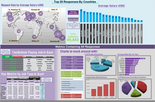
If you need to create or improve your dashboards, I consider Chandoo's resources one of the best to get fresh ideas. Chandoo did a dashboard contest one year ago, and was able to collect 66 top quality Excel dashboards that everybody can download. Here is the link to the article.
Important: Most of the dashboards used VBA macros, so it is an important skills to learn if you plan to work on them.
Stadtbilder gave us a different way to map population. "While traditional maps show us buildings, roads and physical infrastructure, these maps reveal where and in which form the city is alive." In the example below, the map shows the density of food, nightlife, shopping, and music locations in Hamburg. It is really a cool way to visualize the city dynamics. Here is the link to the website (link).
Do you need to track you main source of revenue? There is an interesting way to do it using Tableau. Tableau allows us to connect to your database, and create maps and tables updated in real-time. It is also possible to share your dashboards through internet. Here is an example of Scott Walker's donors visualization map published in the Cap Times. Here is the link.
It is one of my favorites map visualizations. It will help you to find the most popular websites in this moment. It uses efficiently size (popularity), color (country), and distance (interdependence) to create clusters. It is really a beautiful analytical visualization work. Here is the link of the website.
How many tweets have been sent in US by type of device? This answer can be found in this link. Although this software is counting more than 200 million tweets, it is really fast generating the maps and calculating the number of tweets by device and specific area. It uses a new more efficient algorithm to process information called nanocube (paper).